
When envisioning a cruise ship, the image that often comes to mind is a brilliant white vessel gliding through sparkling blue seas beneath radiant sunshine. But why is white the prevalent shade in luxury cruising, while cargo and military ships showcase different colors? This choice is rooted in a captivating mix of historical tradition, smart practicality, and scientific reasoning. From temperature regulation to visual camouflage, the colors painted on ships reveal much more than just style.
Ship coloration doesn’t happen by chance. Key considerations such as weather conditions, operational efficiency, and strategic objectives shape the color decisions. Cruise liners and luxurious yachts often display sleek white exteriors to symbolize purity and high standards, whereas merchant ships and naval vessels typically adopt more functional color schemes.
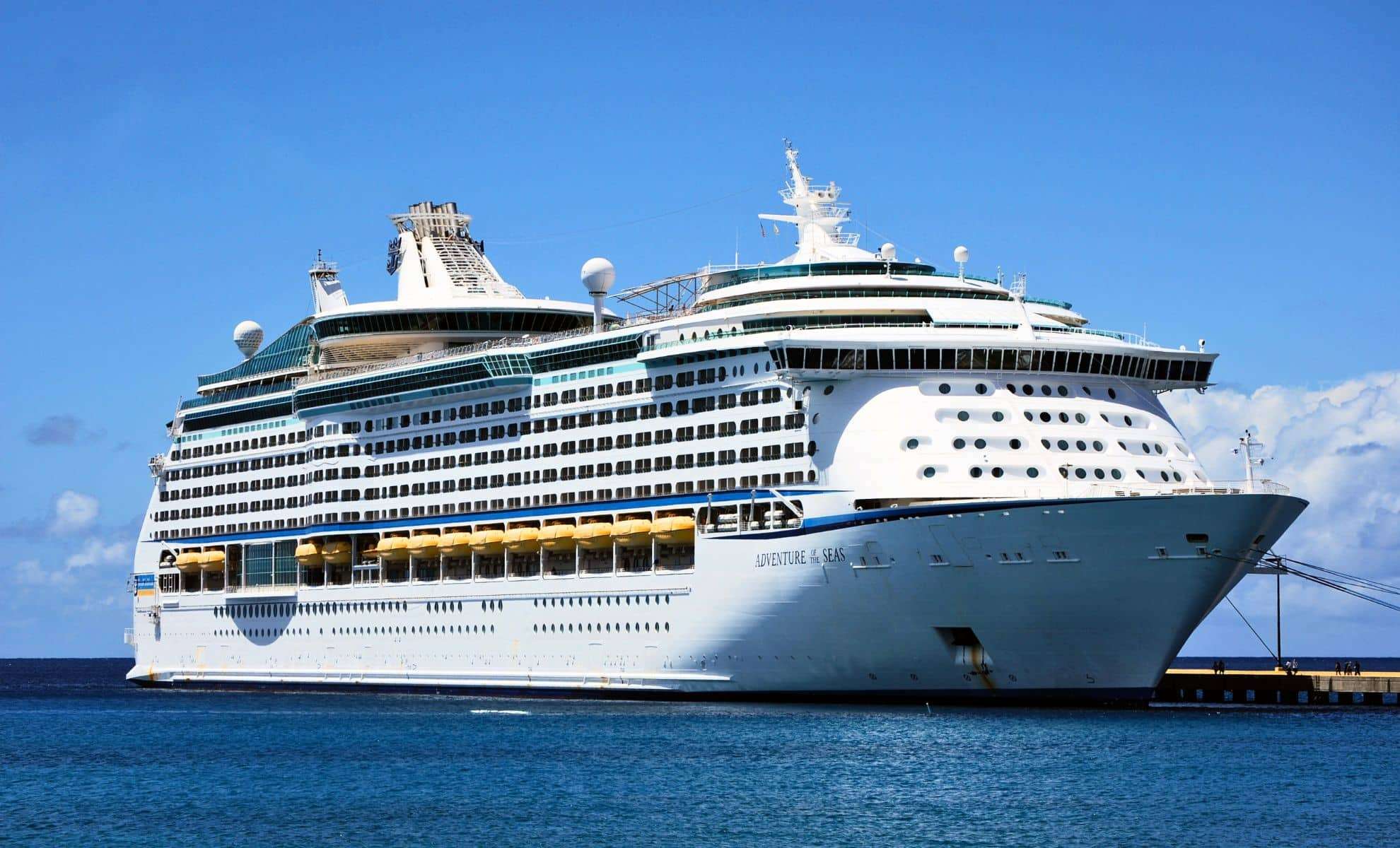
Why White? More Than Just Looks
The pristine white finish on cruise ships serves a dual purpose, offering both visual appeal and practical advantages. White is universally linked to purity and elegance—qualities that cruise operators want to convey to their clientele. A sparkling white ship suggests cleanliness and refinement, enhancing passengers' expectations of onboard luxury and comfort.

Beyond aesthetics, the color white plays a vital role in thermal management. It reflects the full spectrum of visible light, which helps keep the ship's surface cooler under blazing sun. This cooling effect means reduced demand for energy-hungry air conditioning on cruise ships, especially those traversing warm tropical waters, leading to savings on fuel and electricity. This principle also explains why aircraft commonly adopt white exteriors, merging style with efficiency.
Nevertheless, branding influences paint choices in the cruise sector. Some companies are experimenting with more vivid hues and eye-catching patterns to differentiate themselves. Still, white remains the primary base color, often accented with bright tones that bolster brand recognition.
The Story Beneath the Waterline
While the upper structures of cruise ships exude whiteness, their submerged hulls often sport darker shades like navy blue or red. This convention serves both practical needs and longstanding maritime customs. Darker colors conceal rust and stains commonly found where the hull contacts seawater, preserving the ship’s polished look.
Additionally, the white hull enhances visibility, standing out vividly against the blue ocean and sky, creating an impressive spectacle for observers and travelers alike. This is quite different from the design of military vessels, which aim to remain as hidden as possible.
Naval Tactics: Blending into the Waters
Military ships contrast sharply with their civilian counterparts, focusing on stealth rather than display. The subdued grays and muted blues seen on warships are intentional, meant to reduce their prominence against the ocean’s horizon. This camouflage strategy dates back centuries, with records indicating that even ancient scout ships were painted in specific shades like "Venetian" blue to avoid detection.
During World War I, the concept of "dazzle camouflage" emerged, employing disruptive black-and-white patterns designed to confuse enemy submarine targeting. Rather than hiding, this method aimed to distort perceptions of a ship’s speed and position. While modern navies have largely abandoned this technique, muted paint colors remain standard for minimizing visibility.
The stark difference between the bright white of luxury cruise ships and the low-profile tones of warships reveals the varied goals behind maritime designs. Whether attracting tourists or evading adversaries, ship colors exemplify the creativity and purposefulness of naval engineering.
- Categories:
- Science


0 comments
Sign in to Comment